I am mad about the new Jags Helmet. Look at this turd:
I hate it. I want to talk about it. So lets pretend I made this several months ago while it was relevant. I also made a comic about it:
http://www.thedrawplay.com/?p=707
Overall I like what Nike is doing. I disagree with some of the choices they make and tend to think they might go too far in alternate "artistic" directions, but overall I like that they are trying new things. While I hated the Seahawks new uniforms when they debuted, as the season went on I appreciated them more. They were certainly more interesting than the previous uniforms.
A fair amount of the league suffers from boring uniform syndrome (The Jags were one of them) and Nike seems to be trying to break from the traditional molds. Some of those attempts have looked good (The new Vikings uniform) and some have been misguided concepts (The grey Seahawks uniform, which ended up just looking like a really wet and dirty version of the white ones). But overall, Nike is trying to do new things, and while it tends to be very hit and miss, I love that they are trying.
The Jaguars revamp is a weird mixture of hit and miss. The new logo is nice, but doesn't really feel different, which considering the radical uniform changes, feels like a missed opportunity to do something new. However I love the Shield variation of the logo. It's classy, and it does enough to set the Jags apart from other angry animal heads (The league has too many angry animal heads for logos)
The new jersey is sweet. I love the teal sleeves, I love the font. I like the shield logo on the shoulder. The gold collar is kinda eh, but it's not bad. It doesn't bother me. The pants I like, I love the big stripe down the sides. But then again I'm very biased against solid pants. Pants need to have vertical stripes. Stripes are like instant awesome for pants. Solid pants without stripes, especially black ones, just look bad. The Ravens and Saints look like they are wearing leotards. Get stripes you jerks. Fix it, Nike. But I digress. The point is, I like the Jags new uniform. It's very different, it stands out, and it's certainly far more interesting to look at then the boring snoozefest they had going on before (I can barely even remember what the previous uniforms looked like already).
But then we get to the helmet. Oh god, the helmet.
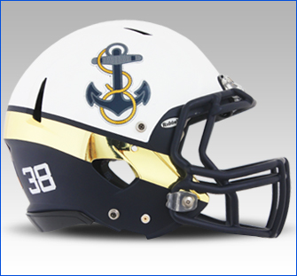
The helmet is Nike at it's worst. The helmet is Nike going "Lets do something no one has tried before!" without stopping to wonder if the reason no one has tried it before was because it's stupid. A two tone helmet? I can get behind that idea. In fact, I like that idea. Many helmets have a colored stripe in the middle, I can get behind an expansion of that, taking that idea a few steps up. Check out this helmet from the Navy uniform:
That design is awesome. It's different, it's striking, it's memorable, it follows a neat concept, all in a way that just works. I'd love to see something like this tried with an NFL team. This was a Nike design, so I know they are capable of it. What I don't want? A crappy gradient bisecting the helmet on the least interesting axis, with two different types of finishes.
Seriously what the hell, Nike? First off, the gradient. It's too small/short. The helmet feels very bisected, but in a weird murky sense. The Gradient should be longer, for a more gradual change from black to gold, or smaller, making it harsher and more pronounced. As it stands, the gradient isn't deep enough to make a sexy transition, or sharp enough to make a bold statement. it's in this weird in between world where it you just kinda wonder why it's there. This might have worked, but it's hampered by the second issue: the angle.
The gradient cuts the helmet in two hemispheres, a back and front. It bisects the helmet through the middle, from ear to ear, over the top of the head. From what the Nike folks said, I think the intention here is that from head on, the helmet looks black. From the back, the helmet looks gold. That seems to be a fairly deliberate style choice, but the problem is how often do you look players head on? 99% of the time you are getting an angle that will show the godawful gradient. So practically, it's kind of pointless. The gradient would look cooler, and possibly be just as effective, if if bisected the helmet at a different angle, kind of like how the Navy helmet bisects around 45 degrees, separating the crown/front with the bottom/back. It's a better angle and follows the contour of a football helmet much better, as well as following the design concept. Good designers use concepts to drive the design, instead of doing what "looks cool". So what was the main design concept of the helmet?
When I watched the press conference the dude in charge kept talking about "Coming out of the shadows, we wanted to make a design based on the Jaguar hunting and coming out of the shadows, SHADOWS.
COMING OUT OF THE SHADOWS. COMING OUT OF THE SHADOWS".
COMING OUT OF THE SHADOWS.
The helmet has the black in the front. The shadow is in the front. The helmet is going into the shadows.
They didn't even follow their own artistic direction. Which sucks, because some minor changes would have made the helmet look pretty good. If they put the black on the bottom, at the 45 degree angle, even with a gradient, that would give an impression of coming out of the shadows. It would even fit in with the default jersey! Hell, almost anything might have been better then what they tried. Instead we have an extremely awkward helmet that looks black from the front...mostly. Gold from the back...mostly. A Logo Decal that stands out uncomfortably over the gradient instead of blending in like a good design (It looks like a big sticker), and worst of all, two types of finishes. Matte black, and glossy gold. I can't even figure out what the point of that was. Was it because Matte doesn't reflect the sun as much so it looks like shadows? That's all I can come up with. It stupid.
One last thing: The gradient might have worked a little better if there was a gradient somewhere else on the uniform, because at that point it would have been a motif. But since the gradient fade is only on the helmet, it feels isolated from the rest of the uniform in an awkward way.
Despite all the effort that I'm sure went into this design, it looks like some Photoshop novice slapped a crappy gradient on a helmet and called it a day. All this work for this result. It's a shame, because a few tweaks could have made something different and memorable in a good way, instead of a dumb one.
So I decided to have a little fun with it. I pulled the picture I drew for the comic into it's own photoshop file, and I spent half an hour coming up with different combinations, just too see if I could do something better in minimal time. Most of them are just alternate variations, to see how things looked with no gradient.
 |
| Here is the original version I drew for the comic. The gradient is actually a little softer than what appears to be in real life. |
 |
| Here is a version with a very gradual gradient. I'm not sure it looks better, but it's certainly more gradual and less sharp bisect. it makes the angle of the gradient bisect more reasonable with a deeper fade. |
 |
| Here is a version with the gradient at a better angle, and one that follows the "Coming out of the shadows" theme. The black would blend in with the black on the collar area, and the yellow section would rise out of the shadows. I think the gradient is still questionable, but the angle makes much more sense. |
 |
| Here is a version of the Navy helmet angle, with hard edges, with the Black up front. It looks a little goofy. |
 |
| This is a reversed version, with the shadows on the bottom. Still goofy, still better then the bad angle gradient. |
Basically, after messing around with it for a bit, I think the Gradient was a terrible idea, and even a harsher edge might not be a great idea. But with more time, it might work. I'm not willing to give up on the idea of a helmet with multiple tones, so lets try putting a strip in the middle, and play with solid color variations.
 |
| Teal stripe. Things look a touch arena league, but I'm okay with that. |
 |
| Terrible, bad color combo. Woof. |
 |
| This one I actually kind of like. If you keep the wider bottom on the stripe, it can kind of give the illusion that the jaguar is still in shadows, and is starting to peak through the grass. It's abstract, but I like the balance between the mostly black with yellow highlight. |
 |
| hahahaha no |
 |
| Reversed version of the one I liked. Not as good. |
 |
This was a random idea based around the "peeking out of the shadows" theme, but instead of the top stripe, more of a highlight around the eye area. It's very arena league however, and I'm not sure would look appropriate for the NFL. I like it though, it's different.
|
 |
| Blatant rip off of the Navy idea. I actually kinda like it. It also manages to incorporate the Teal, which I think is missing from the helmet. And better yet, it still "rises out of the shadows" |
 |
| Alternate version of the rip off. Meh, still alright. I tried making the Teal stripe yellow, but it looked terrible. |
 |
What the hell was I thinking, ew
|
I glanced on google, and I started wondering why they decided to do a two tone helmet in the first place. Maybe because they wanted something different, but honestly I wonder why they didn't try solids more.
 |
| Teal with black FM |
 |
| Teal with Gold FM, kinda neat |
 |
| Gold with black FM, ugh |
 |
| All gold helmet, actually quite striking, might have been nice to see. If the jersey is all black, it would work as a "rising from shadows" thing. But I don't know how well it would work with the other color jerseys, with is something you have to keep in mind. You need a helmet that fits all jersey variations. |
 |
| Straight black. Sexy. |
After making multiple variations on the helmet, I got to wondering again. A few teams don't actually use their logo on the helmet. The Eagles have wings, the Vikings have horns, the Bengals have stripes, and the Rams have the horns, which is the best helmet in the league. Why can't the Jags try something new? What if they put the shield logo on the helmet instead?
I didn't do a very good job on this one, but I think it gets the point across. The shield is different from every other logo, outside the Raiders, but lets face it, the Raiders helmet owns. I think the shield logo would set the Jags apart from every other angry animal head, and I wonder why they didn't do that. It would work with every jersey color, and looks bolder and classier than angry cat face.
I also went with a couple "Jaguar themed" ideas but not the actual jaguar. For variations sake.
 |
| I was lazy, but they are cat scratches. It's different at least. |
 |
| Oh lord what have I done |
 |
It's terrible, but I can't stop laughing at the idea of this design on the field.
|
Fine, maybe that was a dumb idea. But I saw this on google:
That looks sweet. I'm not sure if it was official or not, I could barely find info on it, but it looks like it might be an alt helmet. I like it far better. The matte finish looks good when everything is black.
Wait, I had a few more designs in my folder. What might they be?
 |
| The Hello Kitties! |
 |
| The Jags pay tribute to the mighty mustache of Shahid Khan. KHHHHAAAAANNNN |
 |
GODDAMNIT NIKE STOP GIVING OREGON AN IDENTITY CRISIS
|
 |
| THE TRUTH REVEALED |
Weirdly enough, over the course of my screwing around, I actually came to appreciate the original more:
It's weird, but I kinda like it more now. It's not as bad as it first looked to me. However, when I look at the helmet in real life, and not a picture I made, I hate it again.
I think it's because my version isn't different finishes, I never bothered to make the gold look glossy. When you actually see the different finishes in real life, it looks like the front half of the helmet got burned. It feels like an idea that looked really cool on a designers computer, but just isn't capable of making the transition between mediums. I'd love to see what the original computer files look like, because I imagine it probably looks much better. The two different finishes are the biggest problem.